How to adjust Search Bar height padding with CSS code in Squarespace 7.1?
Sometimes, you just gotta squish in that search bar somewhere down in the footer. But no matter how you position it, the search bar just doesn't look even with the other elements.
In this tutorial, I'll share with you the code I use to modify the Search Bar so that it fits inline with the rest of the footer. Spoiler: it's all in the padding!
IF YOU WANT WEBSITE LEADS ON AUTOPILOT, CHECK OUR MASTERCLASS:
Firstly, there are a few preparation steps to help speed up this process:
Make sure you have the (free) Code-Block Identifier Chrome Extension installed - and read this article about Sourcing Block IDs
Work in Chrome so you can use the Block-Identifier
You have a Squarespace Business Plan or higher (no custom CSS code in Personal plans)
Great, now let's move on to a real example.
. . .
Adjusting Search Bar padding in the footer
1. Use Chrome Block Identifier to source block ID (this is the search bar block)
2. Go to Design > Custom CSS > Then copy & paste the following code…
.sqs-search-ui-button-wrapper .search-input {
  padding-top: 10px;
  padding-bottom: 10px;
}

#block-yui_3_17_2_1_1583444453142_58201 {
  padding-top: 0%;
  padding-bottom: 0%;
  font-size: 1rem;
3. Adjust the padding values and play around to see what fits best for you.
4. You can also adjust the font size to be smaller, as this will also decrease the search bar height
Extra Tip for adjusting Search Bar padding
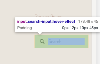
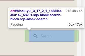
The 4 values refer to the padding:
top / right / bottom / left - you can see this in the highlighted green area.
In Code #1: We modified the padding top and bottom to be 10px, which in turn, decreases the white space and thus, makes the search bar appear narrower in height.
You see the green highlighted padding on the left and right? That 17px used to go all the way round, which caused your search bar to look out of place.
In Code #2: We are using its block ID - ie. referring to the block itself. By setting the padding top & bottom to 0px or 0%, it allows the search bar to move up into that white space, thus making it look more 'in-line'.
Try it out and let me know how you went! If you have any questions, comment below or slide in my DMs @arohavisuals.


