5 Pinterest Boards to create the perfect Moodboard for your Website and Brand
Who else just LOVES Pinterest for inspiration?? 🙋🏻♀️
If you’re not on the Pinterest bandwagon yet, definitely look into it for both inspirational and marketing purposes. I only just got into it recently myself and I’m still learning so much about the various ways you can use this platform!
It was only when I started creating Aroha Visuals, did I realise what a great tool it was for curating design inspiration like moodboards for website designs, understanding your clients’ taste in style, and deriving some bonus traffic to your website!
A Pinterest moodboard will help you narrow down on how you would like your new website/brand to look and feel. They don’t have to be images of website designs specifically, but various other design components that are important to your project.
Here are the 5 Pinterest Boards I created for Aroha Visuals and these are the same ones I recommend to my clients when they’re searching for inspiration.
Pssst... WANT WEBSITE LEADS ON AUTOPILOT?
1. Colour Palettes: neutral or bright? blue tones or warm tones?
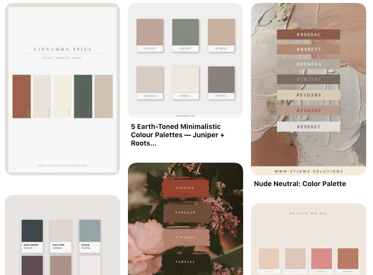
There are so many beautiful colour palettes on Pinterest, many of which even have the exact hex code for the colour shade! Just type in ‘Colour Palettes’ into the Search Bar and enter a creative spiral!
Colour palettes are important because colour have a huge psychological effect on your viewer’s perception. Women looking for a soft, feminine, elegant website are more likely to fancy web designers with warm or neutral colour themes - as opposed to bold, Black & White or cold colour themes.
It saves you so much time trying to figure out the various combinations with your favourite colours and some of them even have ‘themes’ and portray certain brand-keywords.
For example, this neutral spring afternoons palette by Juniper + Roots encompasses the feeling of: growth, grace and feminine. You can find more inspiration on her blog post here: 5 Earth Toned Colour Palettes
Just in case you’re curious to see what my board looks like, you can do so here:
Colour palette
2. Fonts: elegant or bold? serif or sans-serif?
Fonts can tell stories and if a brand has done it right, you can usually guess their brand identity simply by observing their choice of font.
For example: Wedding Photographers usually use elegant calligraphy that portray grace, feminine and elegance. Since the brides often make this decision, it’s also more likely that they fancy a more elegant font style (also because many wedding photographers happen to be females themselves and this style of font best represents them).
If your target audience is primarily males, then use big, bold fonts that portray strength and masculinity. Or if it caters to all gender, then still avoid the cursive calligraphy fonts and go for something a bit more neutral.
Pinterest is like an ocean of inspiration when it comes to fonts. So many beautiful and creative styles - it’ll be hard to ever stop scrolling!
Just in case you’re curious, this is what my board looks like:
Font styles
3. Design style: logos, branding, layout
Designing your logo and brand-look can be a little overwhelming because you don’t even know where to start!! You could do this, or that, or oooh both?
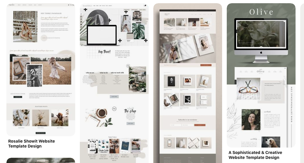
Creating a Pinterest board for Design style will help you compare various styles and then help you eliminate the ones that don’t vibe well with your brand identity.
You can even further segment them into specific sub-categories to help keep your board tidy. For example, you could have: Logo - Branding - Web Design Layout
Sometimes, when people work with designers (whatever field it may be), it’s easy to think that you don’t need to give any inputs regarding the design because she’ll do it for you.
On the contrary, the more input you give your designer about what style you fancy will actually help them serve you better! It’s a win-win! So don’t be afraid to pin to your heart’s desire!
Just in case you’re curious, this is what my board looks like:
logo & branding
web design
4. Lifestyle: fashion style, house decor, travel, work life
What’s your style? What’s the vibe that you’re going for?
Is your business all about that digital nomad life and freedom to work online from anywhere? Then your board will probably look a lot like this: Lifestyle -> Digital Nomad
Or if you started a line of sustainable products or clothes, then you’ll probably want to go for a more organic style, with earthy and raw tones.
Remember, not to be too picky with the images here - the main point of this board is to find images of lifestyle that resonates with you and would also resonate with your ideal clients/customers.
Just in case you’re curious, this is what my board looks like:
lifestyle
5. Quotes: what is the message you want to portray
I love using Pinterest for quote inspiration and often sprinkle them on my Instagram to further portray the kind of message I want to spread. The quotes I usually search for are: motivational, creative, and empowering.
It’s useful to have a collection of quotes you love on your Pinterest board to help you further define your brand identity and voice - even if you don’t end up using them on social media.
Just in case you’re curious, this is what my board looks like:
quote of the day
Extra Tips:
The best images/pins are the ones that encompass the style of your business. You can literally pin anything (and as much as you like). Just make sure you’re staying true to the overall vibe you want to portray and that it would appeal your audience.
If you’re working with a web designer or a brand designer, then creating these boards thoroughly will be even more essential to helping your designer create beautiful work that 100% reflects you and your business.
PS. If you want to take a peek at what my Pinterest account looks like, you can do so here:
aroha visuals
Looking for more design resources to help you create a website that converts? Get access to my free collection of guides, checklists and cheatsheets here!
Did you find that helpful? Let me know! I’d also be curious to hear how YOU use Pinterest and whether you use it for your business too? As always, if you have any questions or comments, just pop a message down below or slide into my DMs here @arohavisuals.


